
Mock design project of creating a label for a beer company. The concept is DnD-inspired
1. Logo Design
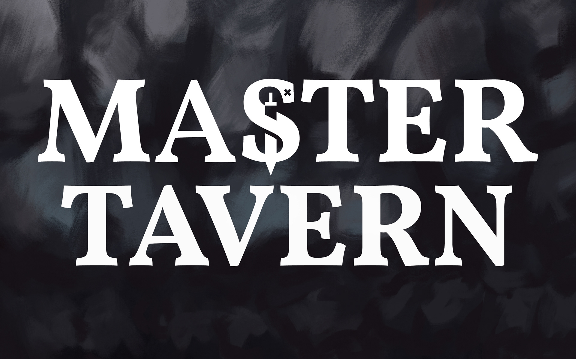
For the logo, I decided to go with using the wordmark type to make the brand feel more organic. Coincidentally since the "S" is shape like a serpent, having the sword going through it make the logo feel more adventurous and fantasy-like.
2. Label Design
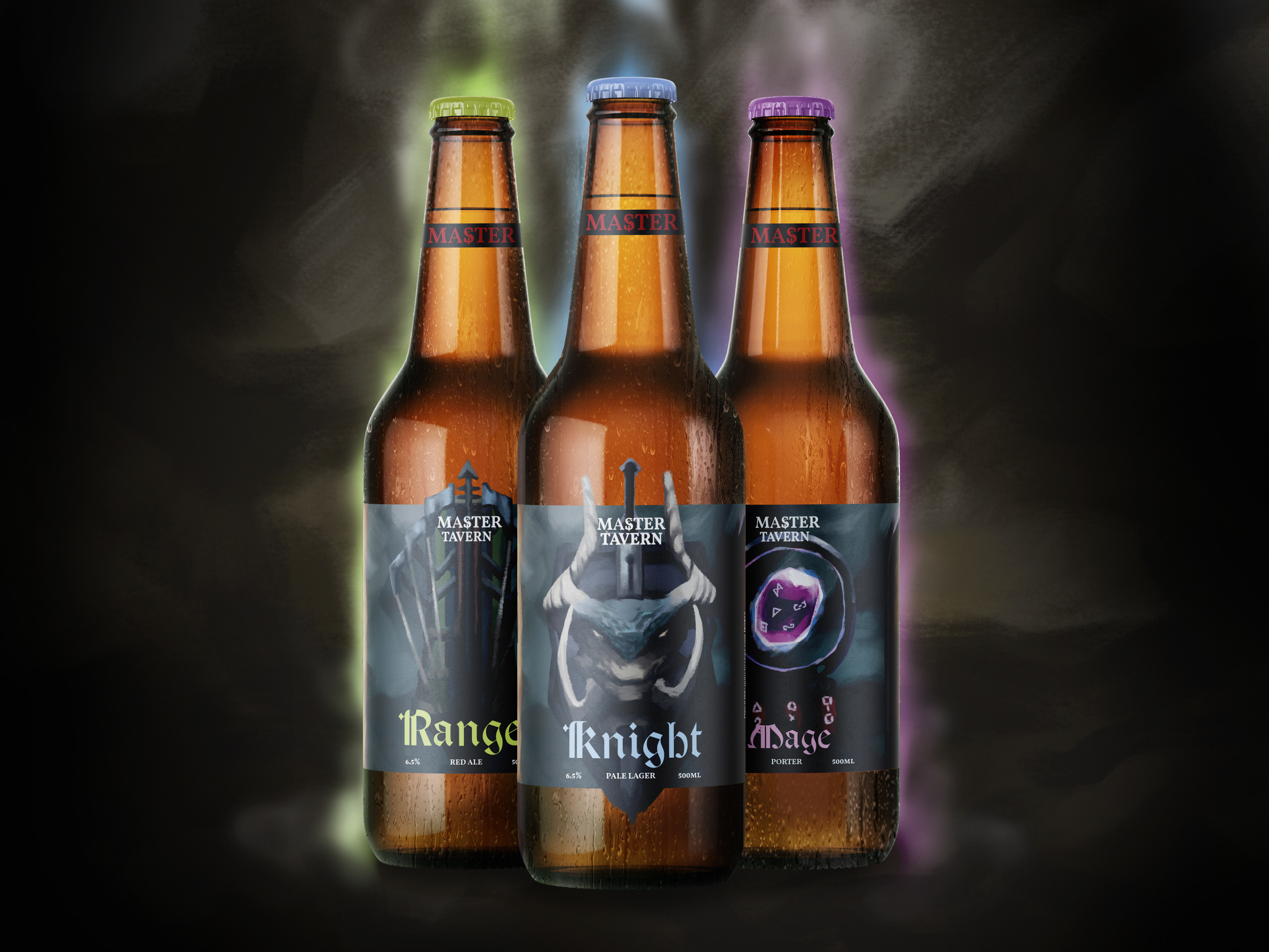
For the label, I decided to go with weapon design as it is gender neutral and anonymous; which means that anyone can wield a weaponry just like how everyone is fit for the brand
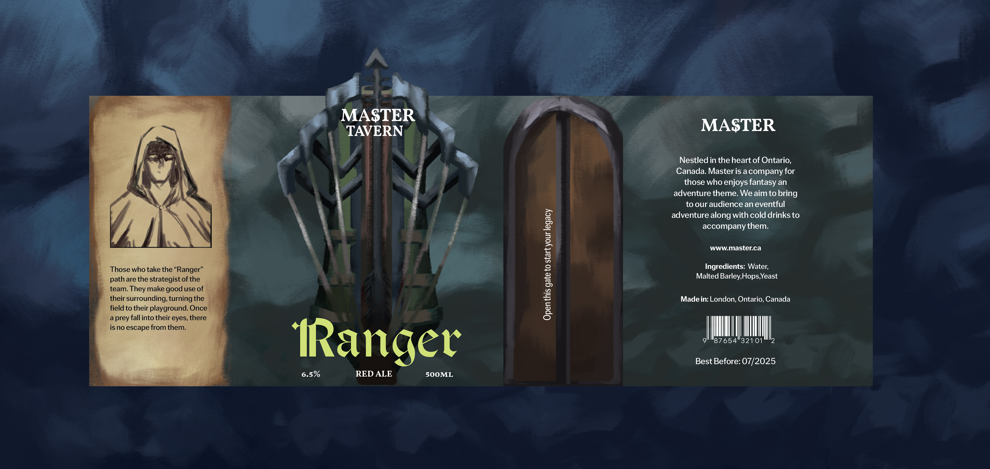
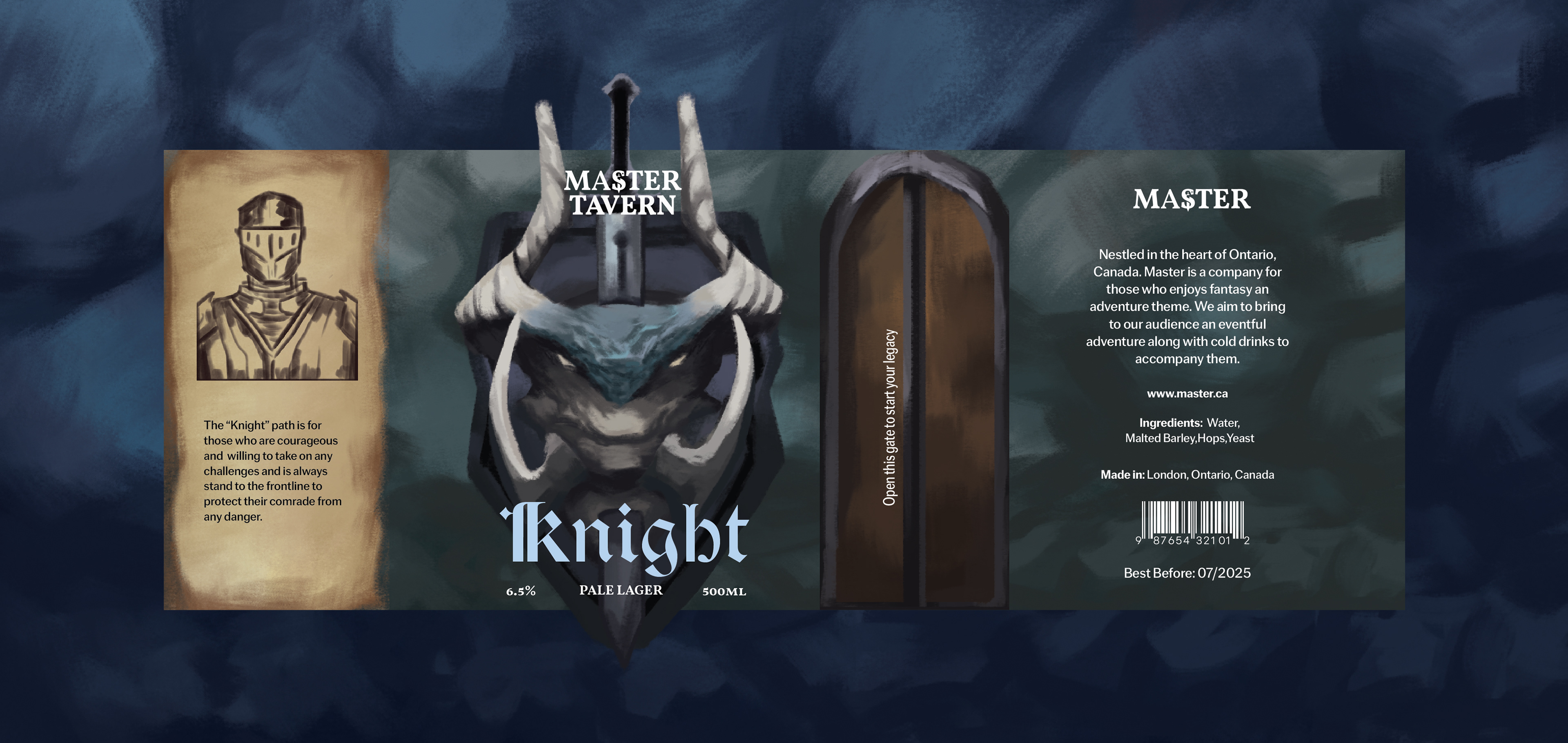
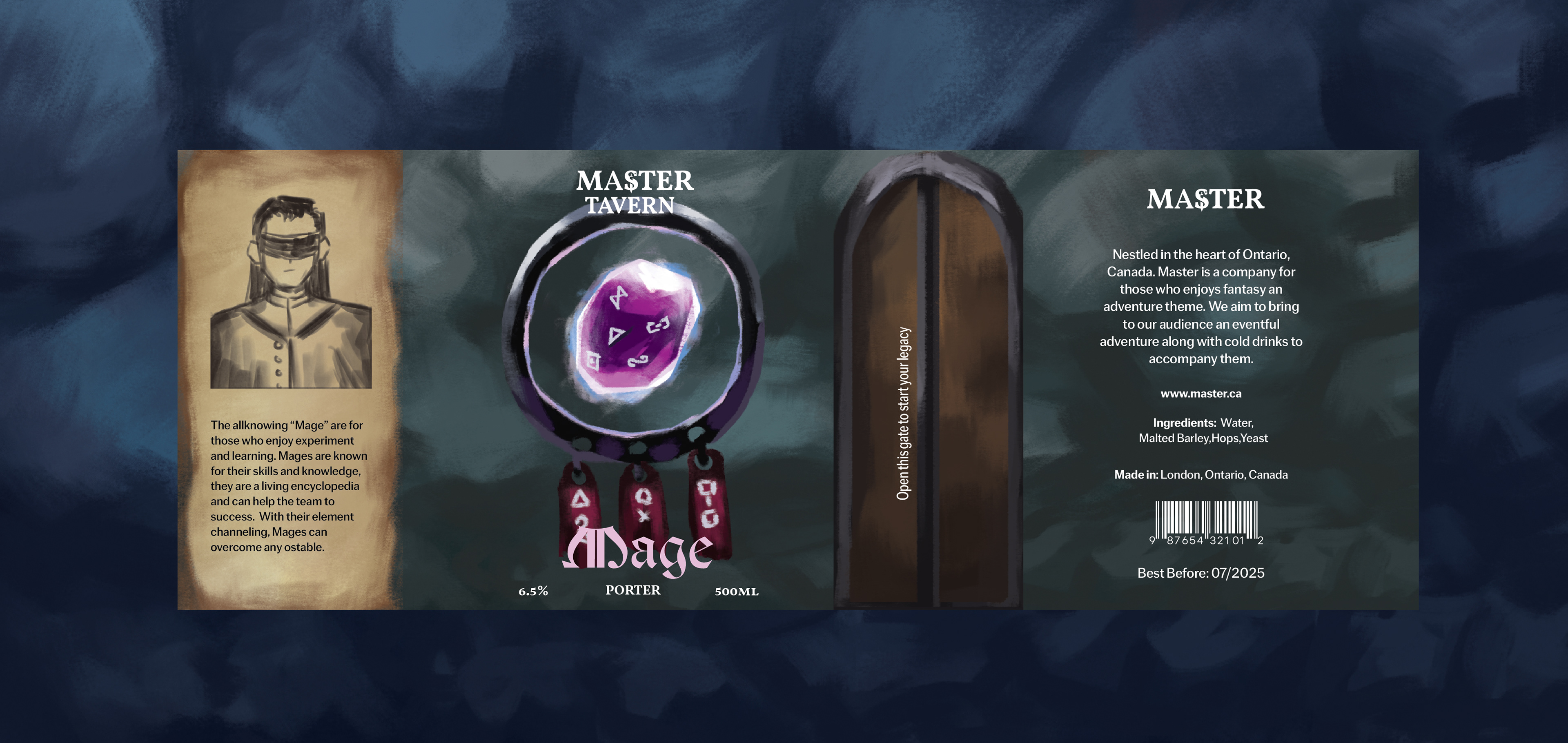
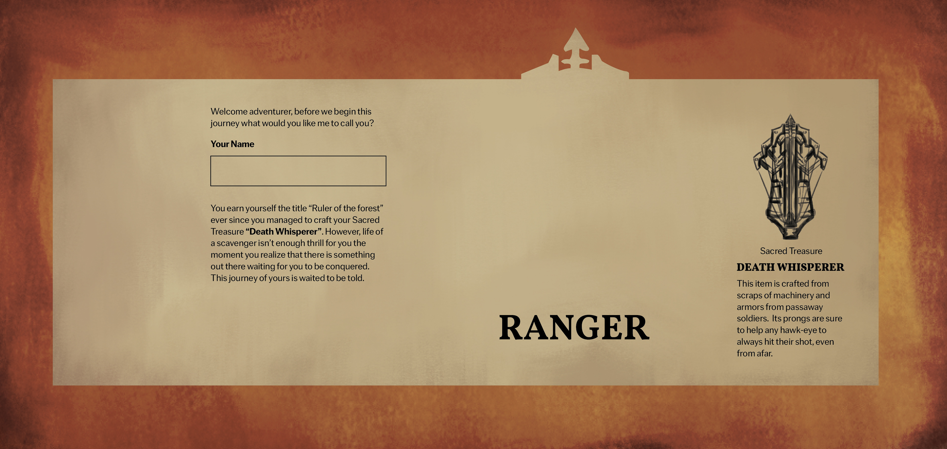
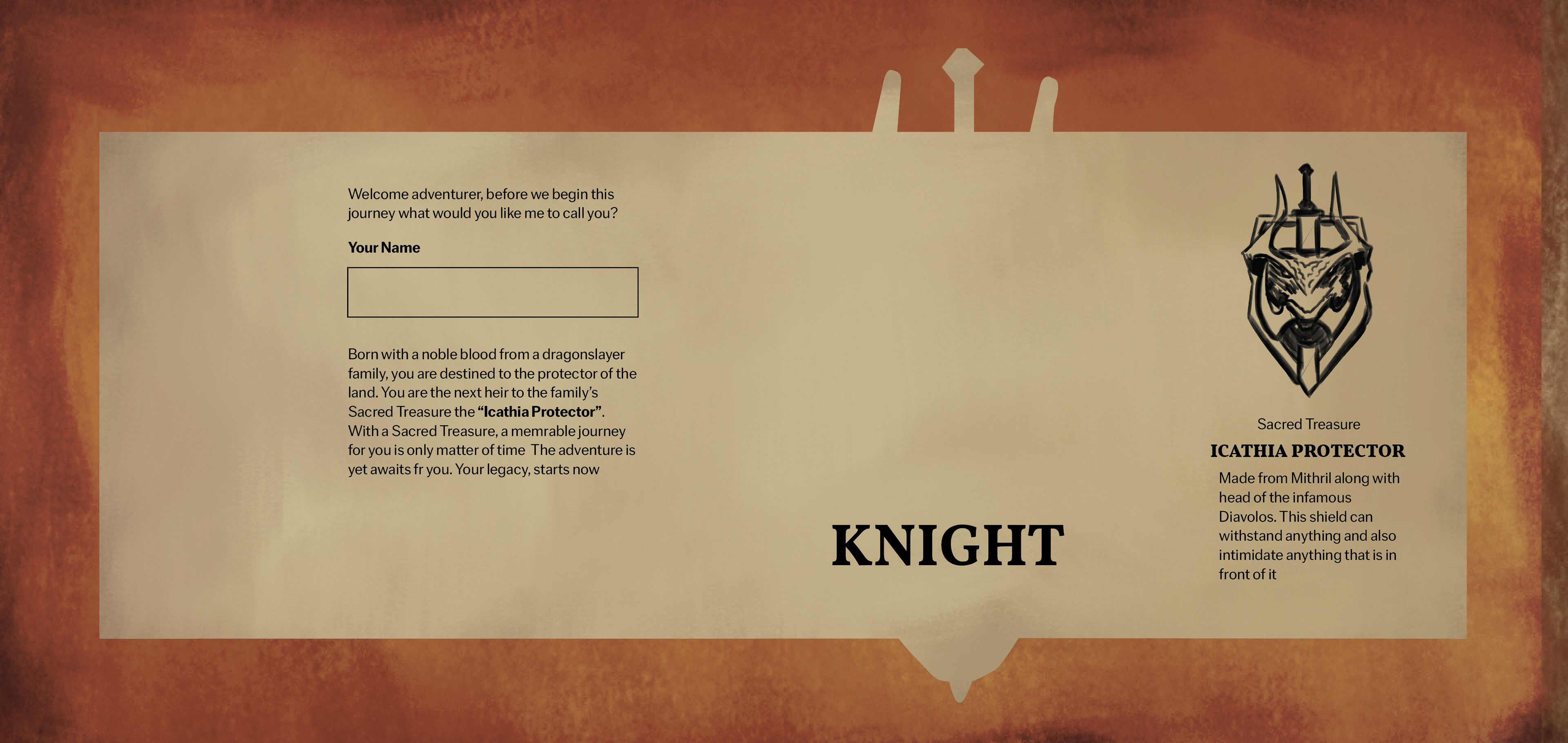
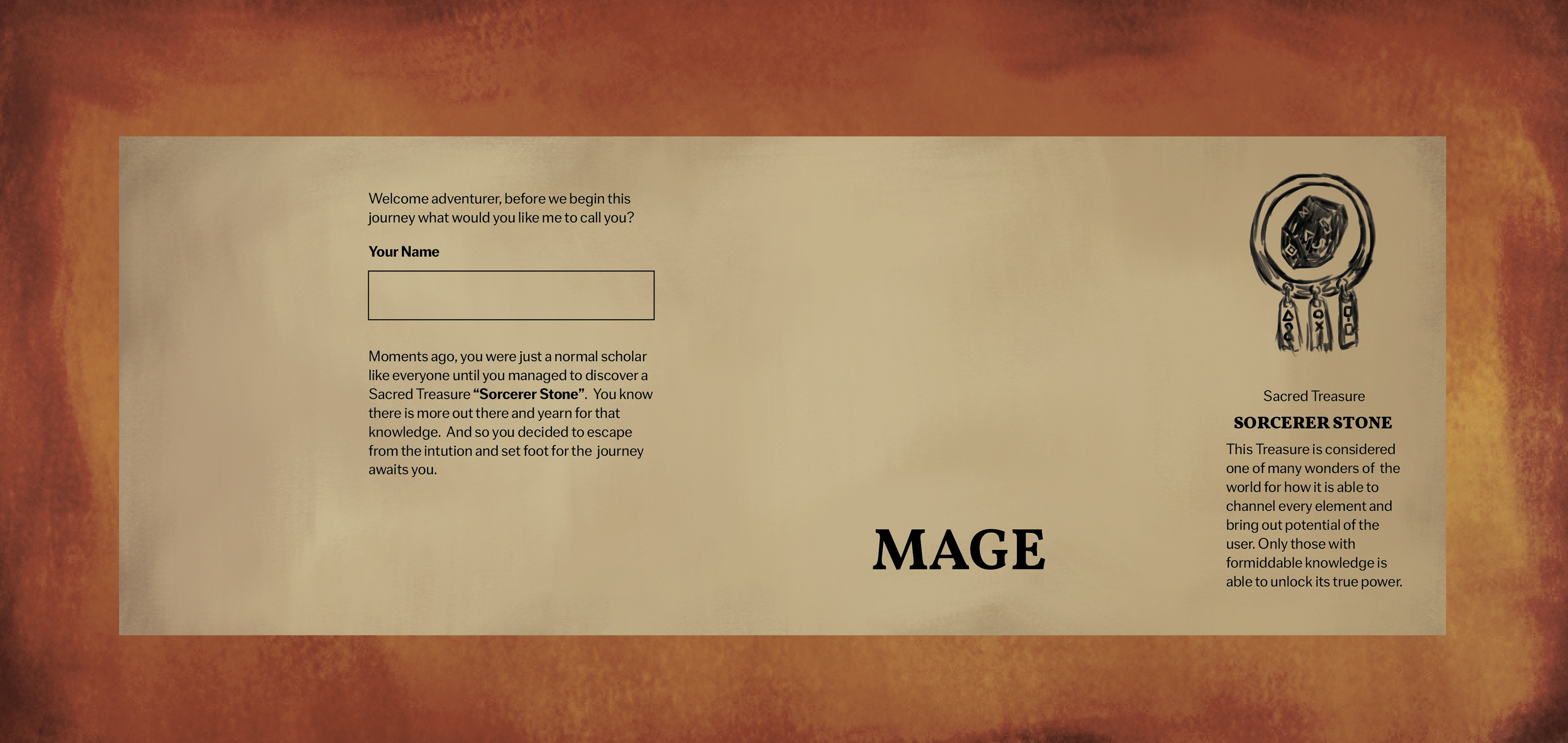
One interesting about this label is that there is a perforated line that fit with the gate image on the label. This mean that when customer peel off the label, there is a character sheet for them to fill in. This make the label itself become reusable for something like a DnD campaign and the different-colored bottle caps can be used as playing pieces.
3. Ads Design
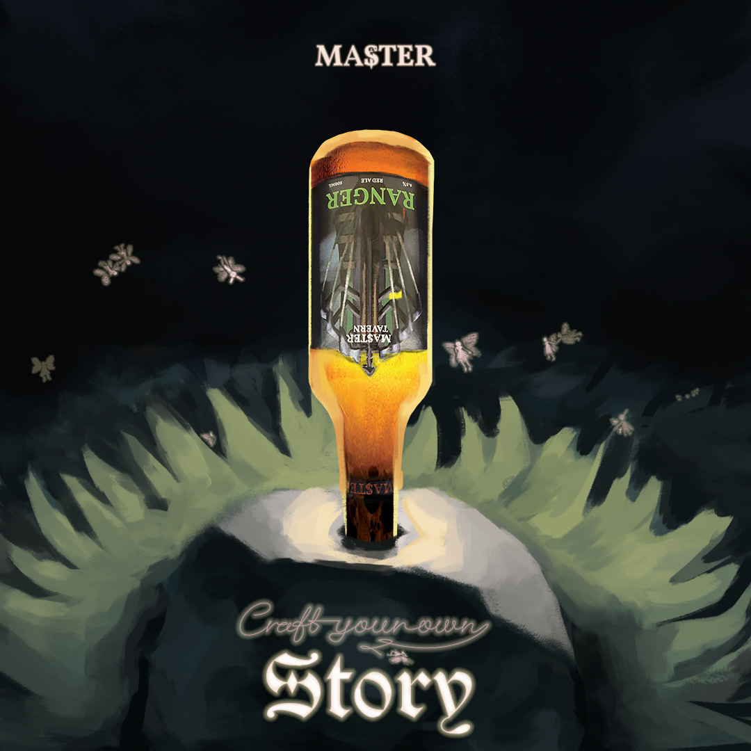
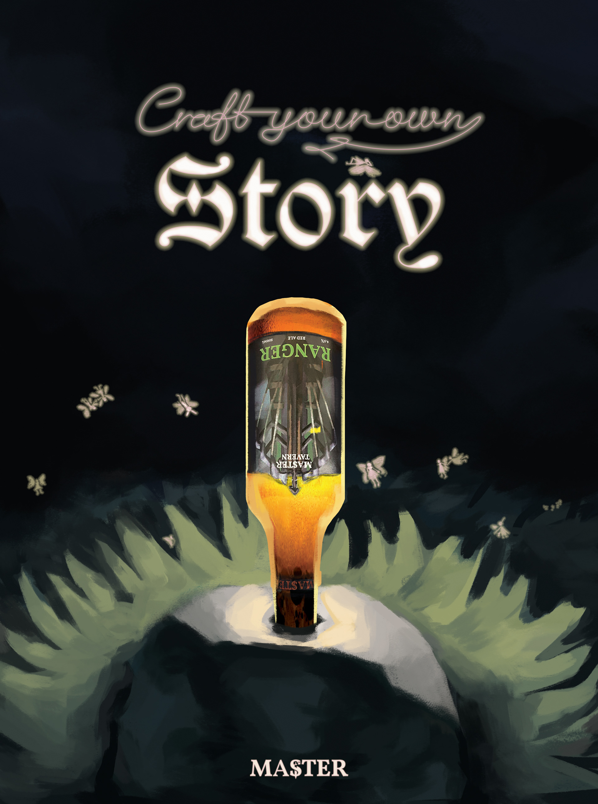
I want to use the image of the sword in stone to say that our customer is the chosen one making them feel special and getting ready for the upcoming adventure with the brand. If this was on a magazine, the bottle will like a cut-out so that once people take it off, they would get to see a discount offer on the back.
4. Mockup
Thank you for viewing :D